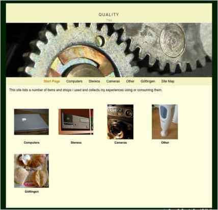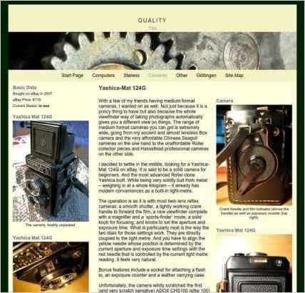
To build “Quality Products,” Sven-S. Porst chose Sandvox. He chose the “Clockwork” design for the site. People may want to visit the site if they are looking for Long term product reviews.
Sandvox features used for this site:Photo Grid, Custom Collection Index, Site Map, Other Objects, Code Injection

Describe your website.
I wanted to share my experiences with usage of a bunch of products – stereos, computers, cameras and a few more.
As I find such first hand reports much more useful than rating sites on the web or superficial reviews by magazines, I figured I contribute a few myself. This has the added benefit that I can easily link to all information on my broken PowerBook G4 or how great my blender is…
Why did you use this Sandvox design?
As my site is mostly concerned with technical devices, the Clockwork design with its cogwheel banner image seemed a good match.
What techniques did you use to build this website?
The site uses code injection to supply some PHP functions which I use on many different web sites.
It uses a modified version of the photo-grid index to group individual pages. It makes the child pages have textual (rather than arrow graphic) navigation links for going to the previous/next page.
Further code injection adjusts details of the design to meet my needs on this site. Most notably, I decided to move the previous/next navigation beneath the main text and remove the link pointing to the parent page.
www.SandvoxSites.com/417


