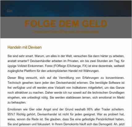
Markus Klopsch used Sandvox to build this website. He chose the “Blueball Apex Brown” design for the site. People may want to visit the site if they are looking for forex, how to trade currencies, San Diego jobs, Oceanside Jobs,.
Sandvox features used for this site:Contact Form, Other Objects, Editing HTML of text, Raw HTML Object

Describe your website.
Make a sufficient income as a FOREX Trader!
Learn how to trade currencies
You will be empowered with the skills and confidence to daily trade the currency markets for profit. Starting with as little as $50 in your own trading account you can realistically expect to replace (or double) your income - or reach most other stated financial goal - within a year.
The opportunity to increase your income without your workload. Job security in any country where public trading exists. Unmatched financial liquidity. Complete control of your lifestyle.
Who is the target audience for your website?
Everybody in San Diego, North County, Oceanside, Carlsbad, Fallbrook, Hemet, Encinitas. Unemployed, professionals, single, married, retired, underemployed. People tired of their industry, ready to make a lateral move.
What is the advantage of your website over others?
In the world of forex traders we have an unique advantage: We are teaching people when Not to trade! Our approach is very conservative. We do not gamble. We train people how to trade currencies safely. You can not put yourself at risk since you will be trained and watched for months until you gained the necessary emotional intelligence.
Tell us a story about this website.
A seasoned "know it all" trader came for an interview. He studied finances for years and never really made it at Forex, like most people. He signed up and found pretty soon that his experience could not keep up with the skill set our traders gain after 3 months. He said "I put so much effort in my education only to find that everybody can do this and make so much more income!"
Why did you use this Sandvox design?
Kuler Solutions Carte Blanche is a wide and clear design. It comes with a cool harmonica, which engages visitors. It looks professional and uncluttered.
What techniques did you use to build this website?
I used a raw HTML object to integrate a harmonica. 2 photo objects pop up pdf files. Another photo object in the side bar displays my picture.
www.SandvoxSites.com/2639

