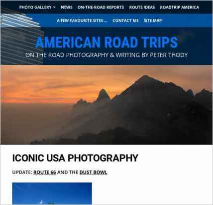
Sandvox was the choice for Peter Thody to build his website. He chose the “Blueball Apex Black” design for the site. People may want to visit the site if they are looking for USA road trip writing and photos.
Sandvox features used for this site:External Page, Photo Grid, Contact Form
Visit Peter Thody - travel writing & photography »

Describe your website.
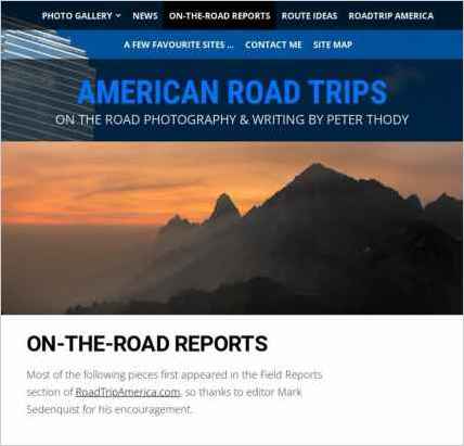
My website includes photos, travel reports from Out & about in the USA, links to articles that appear on the RoadTrip America website, links to related sites and a Contact Me section. The idea is to generate interest in my photography and writing with the aim of winning new commissions.
Who is the target audience for your website?
I'm primarily interested in attracting visitors who are looking to commission travel writing & photography, but the site is also designed to appeal to anyone with an interest in American road trips.
What is the advantage of your website over others?
I would hope that, having visited my site, commissioning editors would choose me over my competitors based on the quality of my photography and writing.
Tell us a story about this website.
I've had a number of USA-based organizations asking me - a British-based photographer/writer - if they can use my material but I think the best anecdote is probably that of an Australian theater company who were putting on a production of "The Laramie Project", a play that looks at the murder of a gay student back in 1998.
As part of the show, they wanted a series of photos from in and around Laramie, Wyoming, and came across mine via a Google search and asked if they could use them.
The result? A British photographer's photos being used for multimedia projection in Australian production of a play set in the USA.
Why did you use this Sandvox design?
I chose my particular design as it doesn't look like a ready-made template and it also offered the flexibility to be adapted to include one of my own photos.
www.SandvoxSites.com/67


