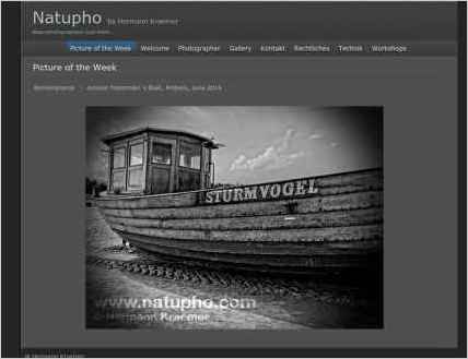
Sandvox was the choice for Hermann Kraemer to build his website. He chose the “natupho” design for the site. People may want to visit the site if they are looking for nature photography in Munich.
Sandvox features used for this site:External Page, Photo Grid, Contact Form, Other Objects
Visit natupho by Hermann Kraemer - nature photography and more... »
Describe your website.
My website is designed as a gallery showing my nature photography work and offers an information resource for other photographers showing some technical reviews. Meine Webseite wurde gestaltet um meine Arbeit als Naturfotograf zu zeigen und bietet anderen Fotografen Hilfe durch Testberichte aus der täglichen Praxis. My goal is to show the beauty of nature in our direct daily surroundings.
Who is the target audience for your website?
The main targets are Photographers, picture agencies, and everybody interested of buying fineart prints of nature photography.
What is the advantage of your website over others?
My website is clean and offers a easy to understand navigation.
Why did you use this Sandvox design?
The particular design gave me the possibility to enlargen it a bit and to support my photographic artwork with its reduced color scheme.
What techniques did you use to build this website?
I changed the size by editing the css code a little bit to give my photographic artwork a little more space on the website. Pagelets are used for sub-navigation in the gallery and for additional information relating to the main content of each site. Additionally I do extensive use of integrating flash based external website to show my pictures.
www.SandvoxSites.com/1096

