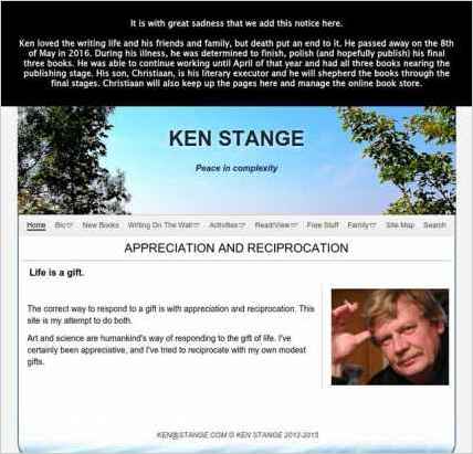
Sandvox was the choice for Ken Stange to build his website. He chose the “Cirrus” design for the site. People may want to visit the site if they are looking for writing, art, teaching..
Sandvox features used for this site:Blog, External Page, Site Map, Contact Form, RSS Feed Object, Editing HTML of text

Describe your website.
This website is the central, easily accessible place about me, Ken Stange, that links together and organizes all my various activities as a professional writer, artist and teacher.
Who is the target audience for your website?
It should be of interest to writers, readers, artists, students, and just anyone interested in ideas, as well anybody who knows about me or my activities.
Why did you use this Sandvox design?
My decision on the design was largely aesthetic. It is elegant and uncluttered, allows just the right number of links to subpages in the header. and my planned replacement header image suited it.
What techniques did you use to build this website?
The links to social networks are extremely useful. Also, I find using the links (both internal and to other websites) is easy and effective.
www.SandvoxSites.com/2881

